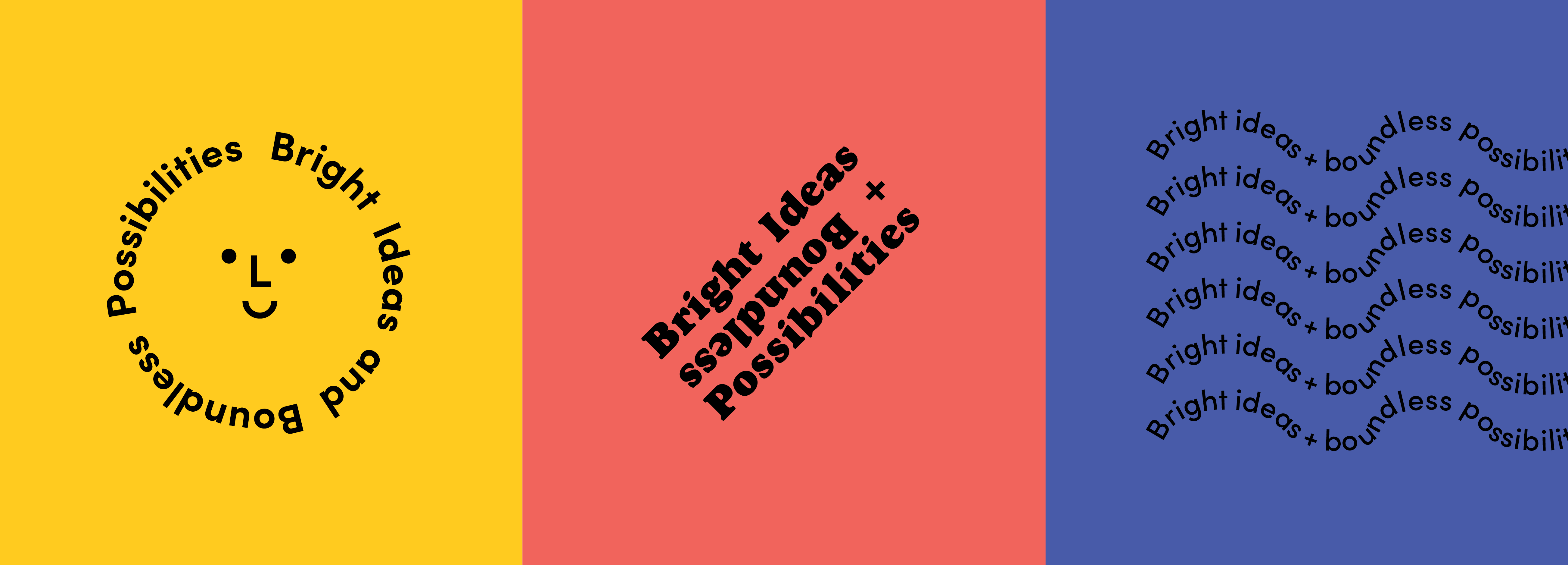
Phase 1: Bright Idea
“It was a gut feeling; we just went for it.”
Just kidding.
During a Monday morning team standup, Linden’s owners and leaders Maggie and Joel York casually mentioned to their team that they wanted to refresh Linden’s brand. We thought ok, great, sounds like fun – we love a branding project. But being that we are who we are, we were going to have to start at the beginning.
See, whether we’re engaged in creating a brand from the ground up, refreshing an existing brand or fully rebranding a brand, there’s a lot we need to know before anything happens with logos, colors, imagery, photography style or messaging. The first – and most important – thing we need to know is why.
Joel: You don’t just jump in and do it because you’re bored with your logo.
Maggie: And we wanted to give the process thought and time, to figure out who we were and who we wanted to be moving forward.
Maggie and Joel started thinking about a brand update shortly after they took over Linden in 2019. They knew they wanted to show who Linden had grown into over the last several years without compromising the foundation of the Linden brand, to shake things up a bit because we aren’t the same Linden we were in 1996, but to do it in a way that would maintain all the things we love about the classic, legacy Linden brand.
The idea of a rebrand took a while to gain traction because, less than a year after the Yorks took the lead, the world shut down. And then we all worked remotely for a year and a half; it was difficult to grasp who we wanted to be when we couldn’t be together and there was so much uncertainty around us. But in 2022, when Maggie and Joel started talking about moving the Linden office to a new location, and after finding the Old Town Fort Collins space, the time for a rebrand was just right.
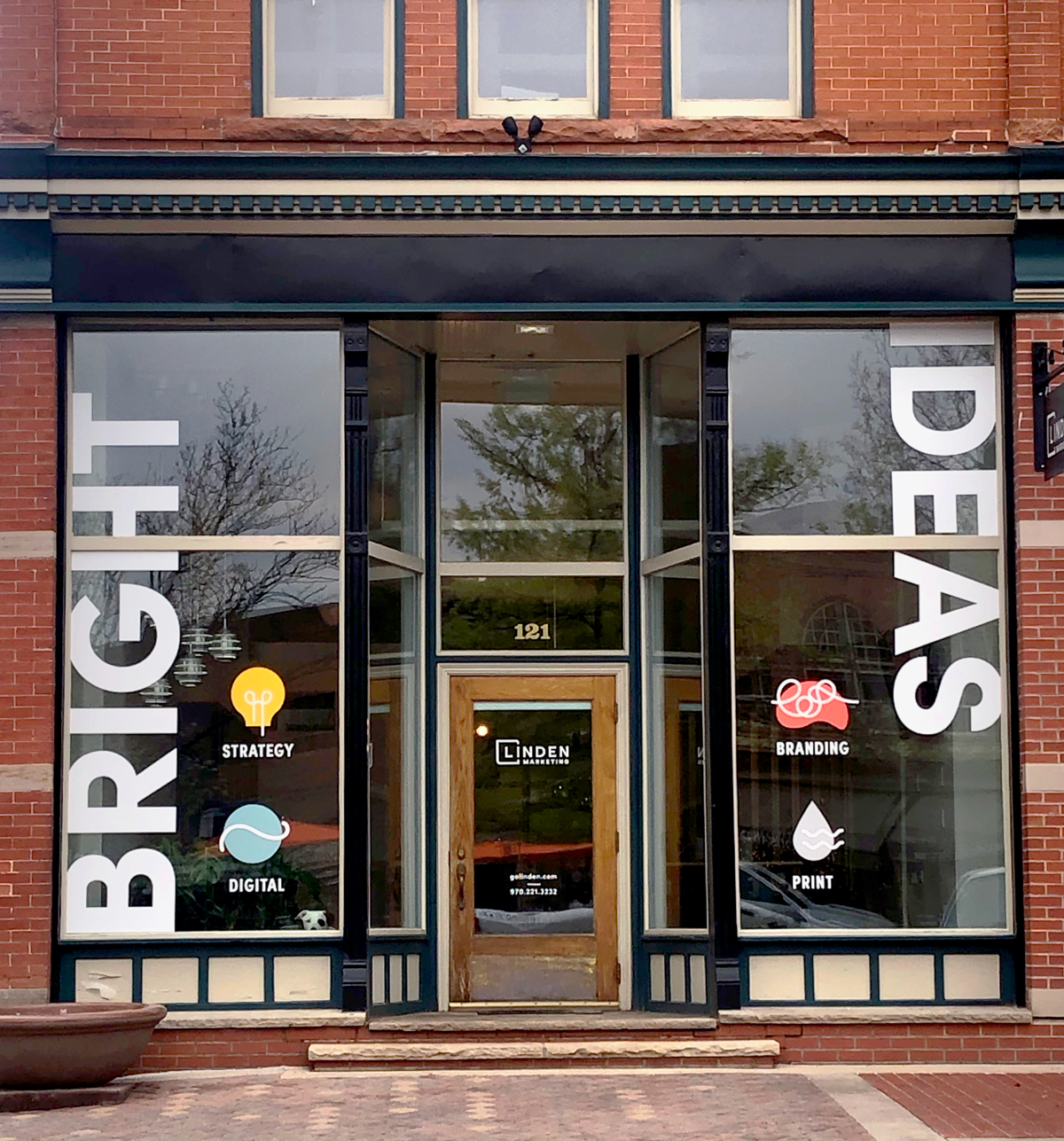
Joel: We’re really excited about making it ours – the brand and the office space – making this space look like us and feel like us by branding the office itself.
Phase 2: Big Dig
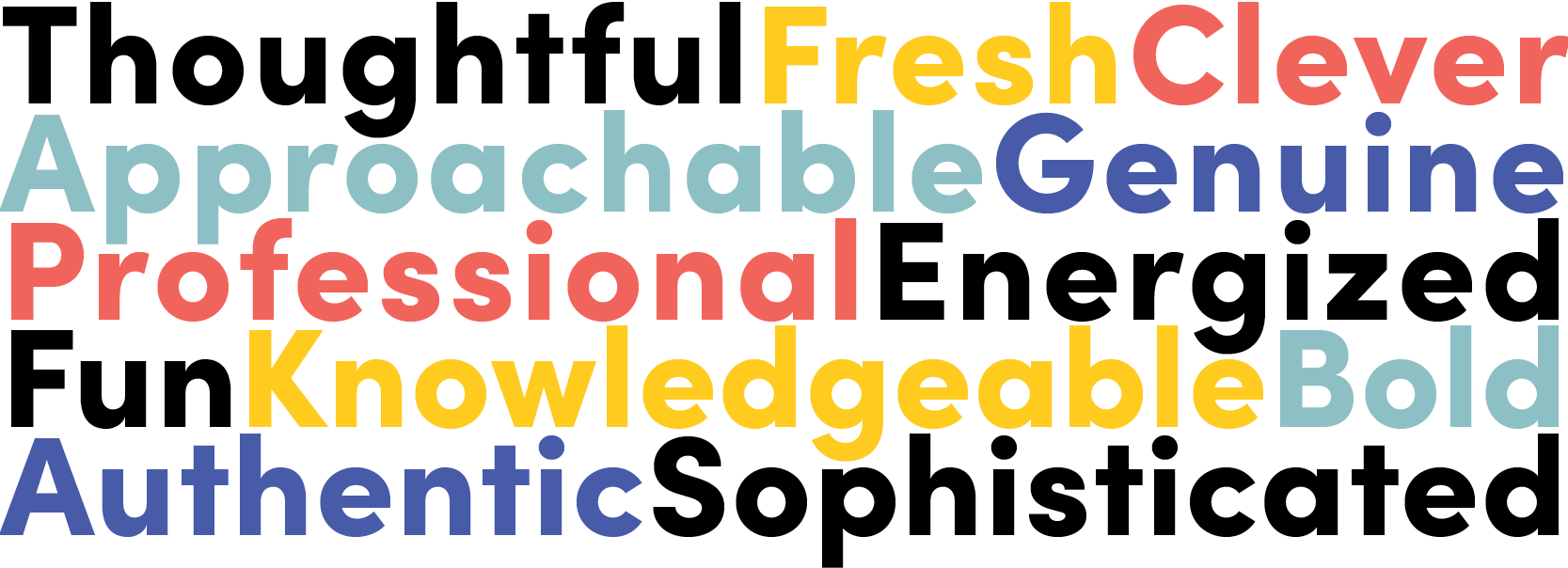
But first thing’s first – we had to do our own discovery process. The Creative team interviewed Maggie and Joel, wrote up a Creative Brief with brand attributes and overarching messaging, created mood boards with a variety of directions and regrouped as a team to make changes and talk through individual elements, ensuring the Linden we were going to put out in the world going forward would look and feel like who we really are.
Maggie: Doing your own discovery process can be enlightening. It’s important. You have to keep asking yourself why – why do I like this or not like this, why am I doing this, why would this work for me but maybe not my clients. If you understand what you are trying to communicate, you won’t lose sight of your why.
Joel: When we give our clients advice during their discovery and branding process, we tell them to be open going into it.
Maggie: Don’t get stuck on what you think you know about your brand; be receptive.
Joel: You need to be flexible and willing to change. Otherwise, what’s the point?
Brand attributes
Phase 3: Boundless Possibilities
During Linden’s rebranding process – the conversations, revisions, pushing ourselves outside of our comfort zone – there were definitely some surprises.
Maggie: We actually spent a lot of time on fonts.
Joel: And that had an effect on our logo.
Maggie: I was surprised we ended up picking something so close to the previous logo. I thought I was ready for something really different. At the beginning of the process I was, but then I didn’t want to make that huge change.
Joel: I was surprised we changed the logo at all! I didn’t think we were going to. But when I saw the old logo with the new brand ideas, it was clear it needed to change. And then changing the Linden “L” led to changing the way we refer to ourselves – we dropped all the noise of “communications” and always having references to CO and WY, and just went with “marketing.” Because we’re Linden Marketing. Clean and simple.
Before

After
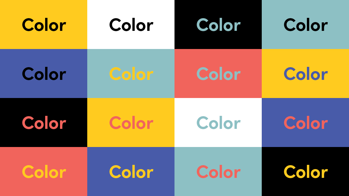
And with that, we were off to the races. Maggie and Joel chose a brand direction, including a new color palette, photo treatment and creative direction, graphic element style and overall brand vibe.
Maggie: The new brand is a big leap, which I didn’t imagine, but I really like it.
Joel: It seemed a little “out there” at first, but I liked it right off the bat, and everything felt right, which was surprising. I didn’t think we’d go so drastically in different directions, but when Maggie and I stepped back and really thought about what was going to resonate with our clients and with our own vision for Linden, this was it.
Color palette
Icon(ic) headers
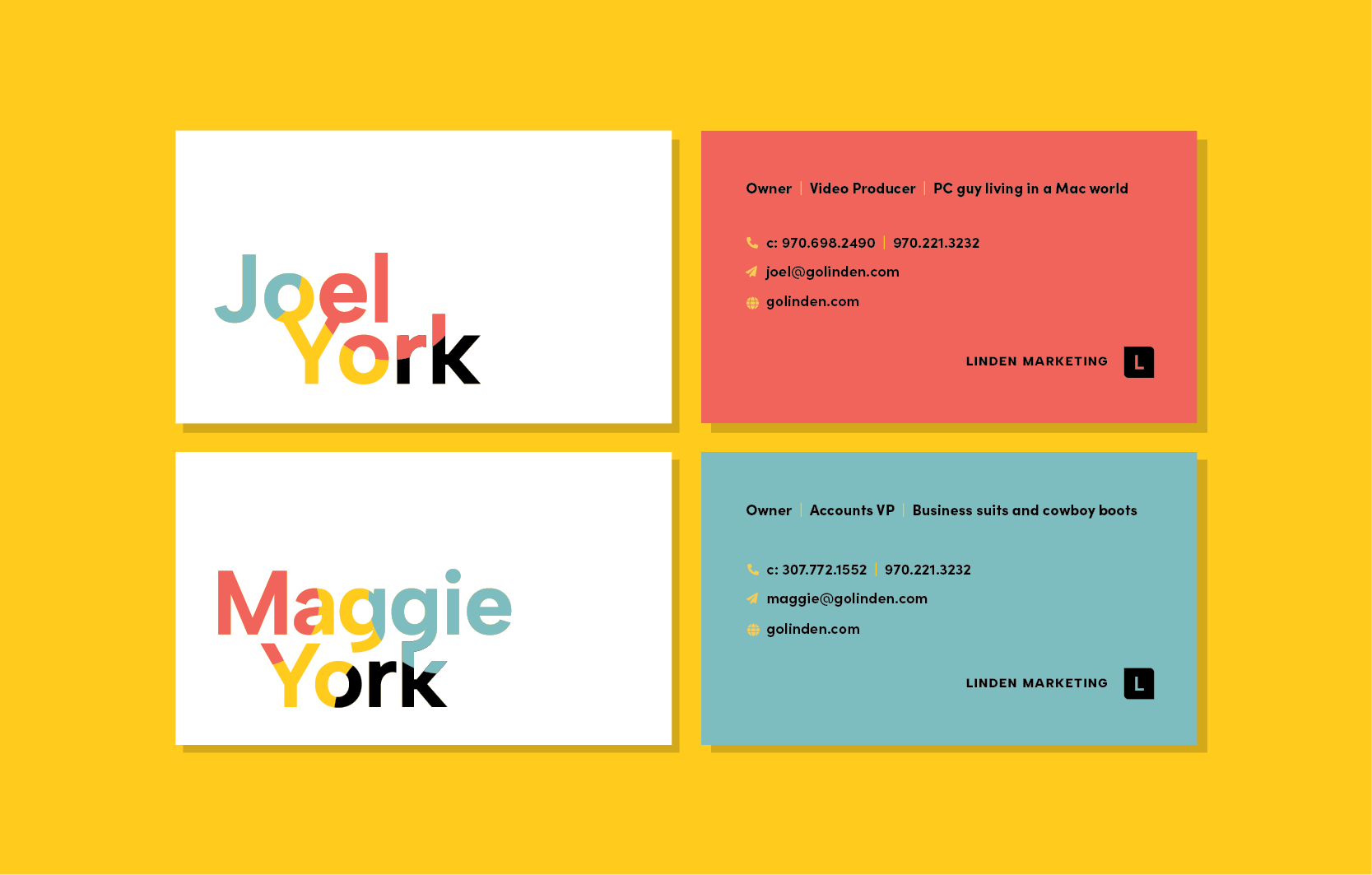
Business cards
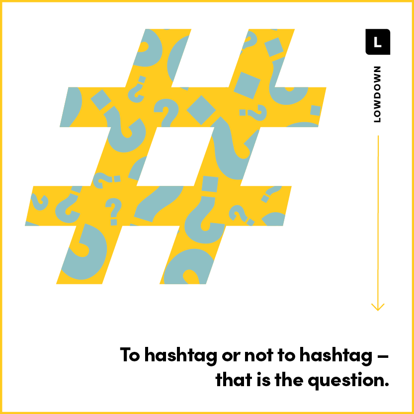
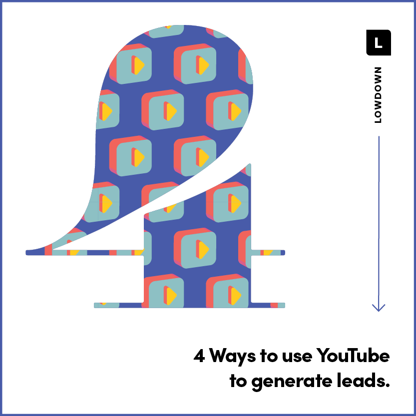
Social posts

Alison Quinn
Creativity, strategy and sparkles: our Creative Director's Big 3. Alison is a self-professed word nerd and lover of marketing that makes you go "whoa!"
