
 Good typography is a powerful tool. But for most of us, creating harmonizing voices between multiple fonts can feel more like black magic than a systematic, satisfying process. Successful font pairing creates visual impact, makes people buy books based on covers alone (yes, this happens) and, most importantly, can demand attention and help deliver your message. So next time you’re pushing pixels around on your screen trying to bring them to life, consider these three golden rules.
1. Honor Hierarchy
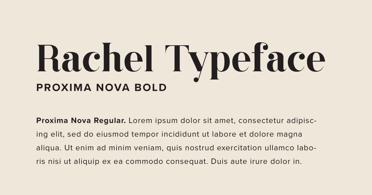
Hierarchy is the key to cohesion and order. Focus on your main header or a phrase that you want to emphasize, and pick this font first. If you choose a bold, stylized font, consider pairing it with a clean and simple face that won’t steal its thunder, like Proxima Nova, a sanserif face.
Think of this principle as if you’re putting two people with strong personalities in the same room. Sometimes they can complement one another, but sometimes they can compete. The same goes with design. In most layouts, if one font has a strong mood, the second font should play a subordinate role. If one font is a fun, chunky script, the second font should resemble basic body text.

2. Contrast & Consistency
Contrast creates energy. Consistency creates safety. Contrasting fonts with different features work together to create visual interest. However, one element should always be consistent in your pairings. For example, if two fonts have contrasting textures, see that they have similar line quality as well.
Consistency is also imperative to creating a professional-looking design when dealing with copious amounts of copy. Make sure that each font used has a stable and established role within your design; for example, one font for headers, one for body copy and one for called-out quotes.
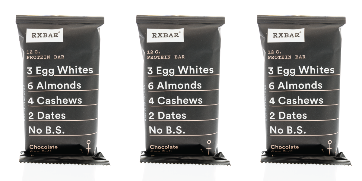
Within this rule falls the art of pairing sans serif and serif fonts. To start, knowing the difference between serif and sans serif fonts is key. The term serif refers to the small lines at the end of each stroke, while a sans serif font, (sans meaning without), does not. When pairing, strive for contrast in style, while maintaining consistency in the shape and mood of the typeface. A good example of this is seen in RX Bar’s combination of contrasting serif/sanserif faces with similar weight and shape.

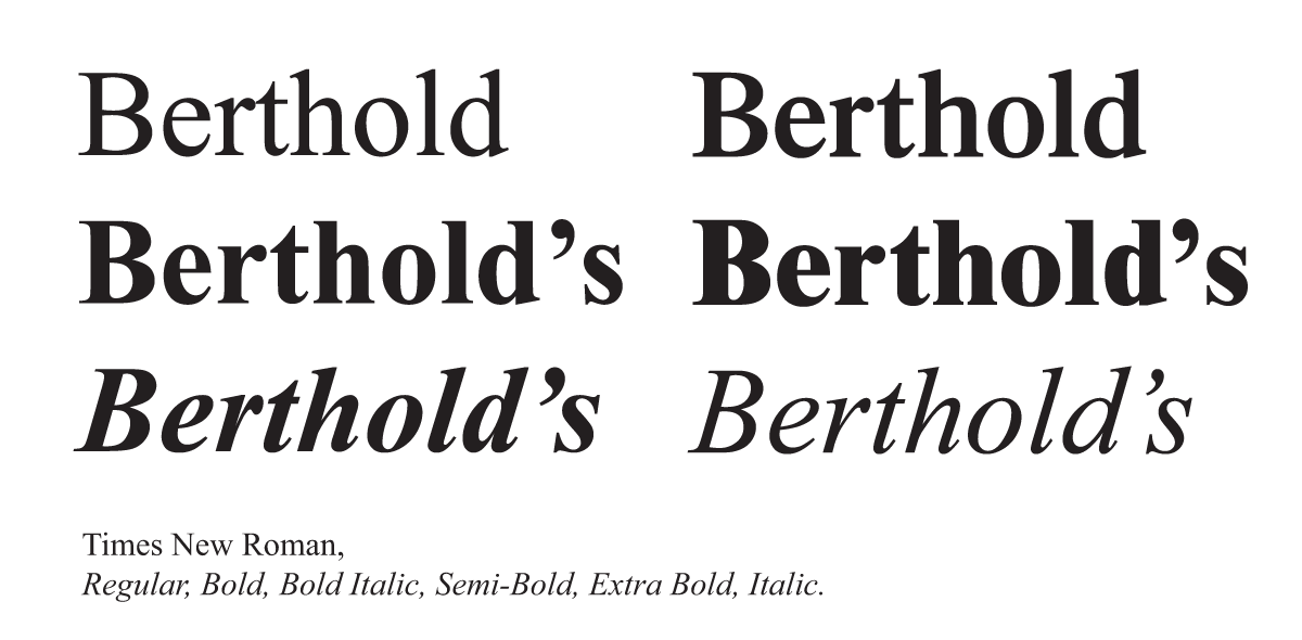
3. Use Font Families
Font families were designed for a reason! A font family is a group of fonts that share a similar style with varying elements such as weight, mood, and line quality. Using fonts that are within the same family may be the simplest way to ensure that your fonts work well together and lend interest to your text. This also saves time if you are working on a tight deadline.


LINDEN STAFF
We love our dogs, espresso-inspired conversations, long walks downtown, cocktails on the patio and finding joy in the details. We take our work seriously and we take life as it comes.