Branding & Packaging
Pine Bluffs Distilling
Pine Bluffs Distilling
Pine Bluffs Distilling needed an established brand before opening their doors for distributing, tasting and celebrating. Our relationship with Wyoming’s newest distillery began with a conversation about who they are and what story they wanted to tell with their products and the place where they make them. It came down to this: authenticity, creativity and hand-made hard work. The Pine Bluffs Distilling brand needed to highlight the experience of distilling grains from local farms on hand-built equipment to create unique, high-quality spirits.
Pine Bluffs Distilling needed an established brand before opening their doors for distributing, tasting and celebrating. Our relationship with Wyoming’s newest distillery began with a conversation about who they are and what story they wanted to tell with their products and the place where they make them. It came down to this: authenticity, creativity and hand-made hard work. The Pine Bluffs Distilling brand needed to highlight the experience of distilling grains from local farms on hand-built equipment to create unique, high-quality spirits.
Strategic Options Narrow the Focus
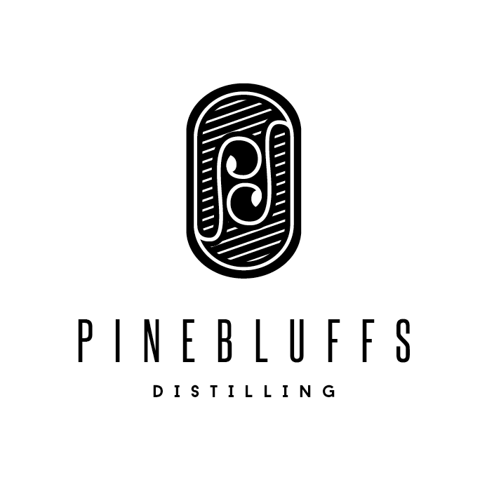
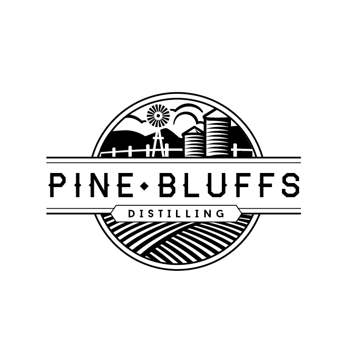
We started with the logo, first presenting several ideas in black and white only. This allowed the Pine Bluffs Distilling team to narrow their focus to just the artwork and typography, without getting hung up on color preferences. When we provided color options and brand marks for their favorites, the logo that would come to represent Pine Bluffs Distilling was made clear.
From here, we developed a set of brand standards and began to bring the brand to life, designing and developing their website and creating collateral print materials.
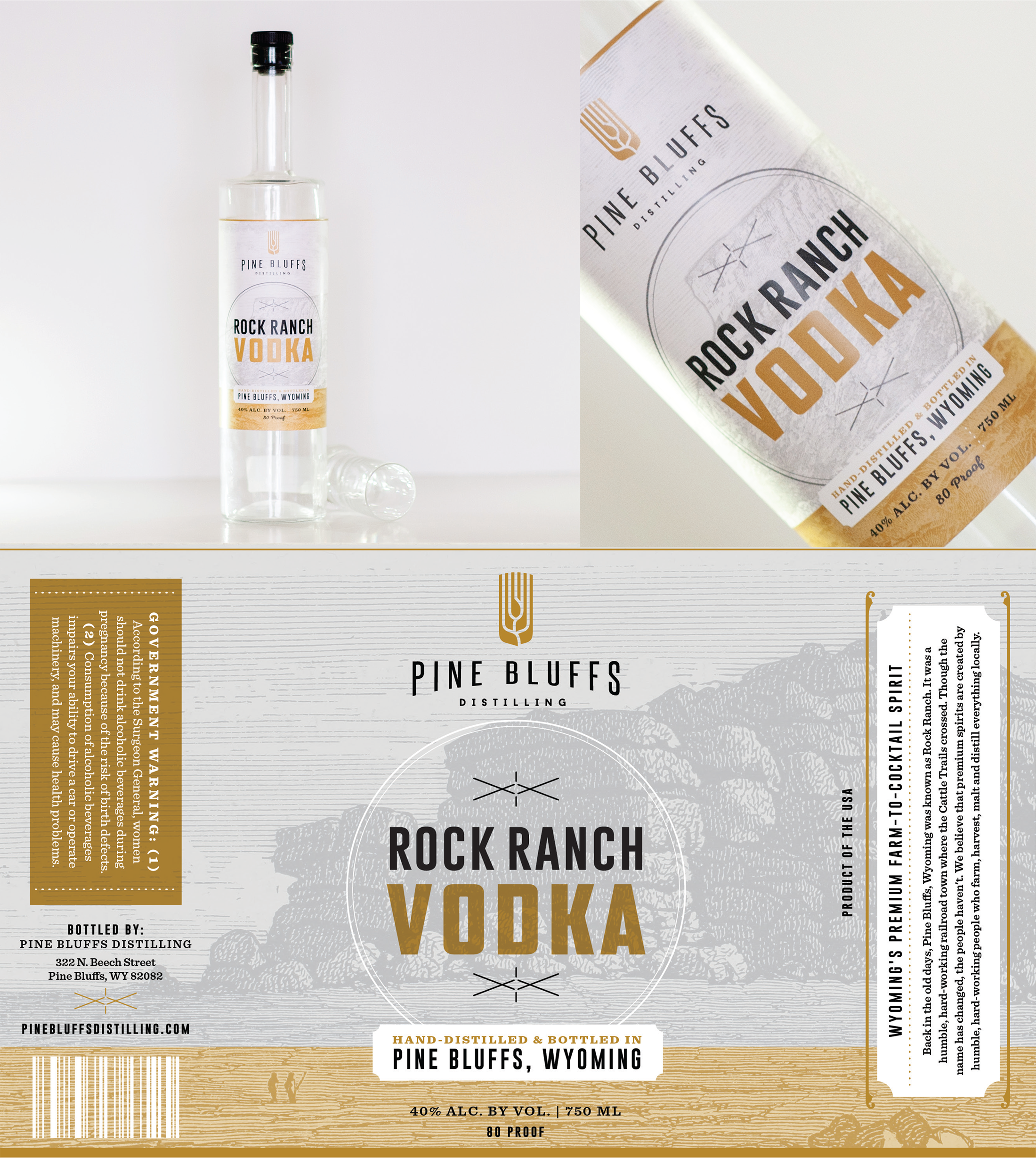
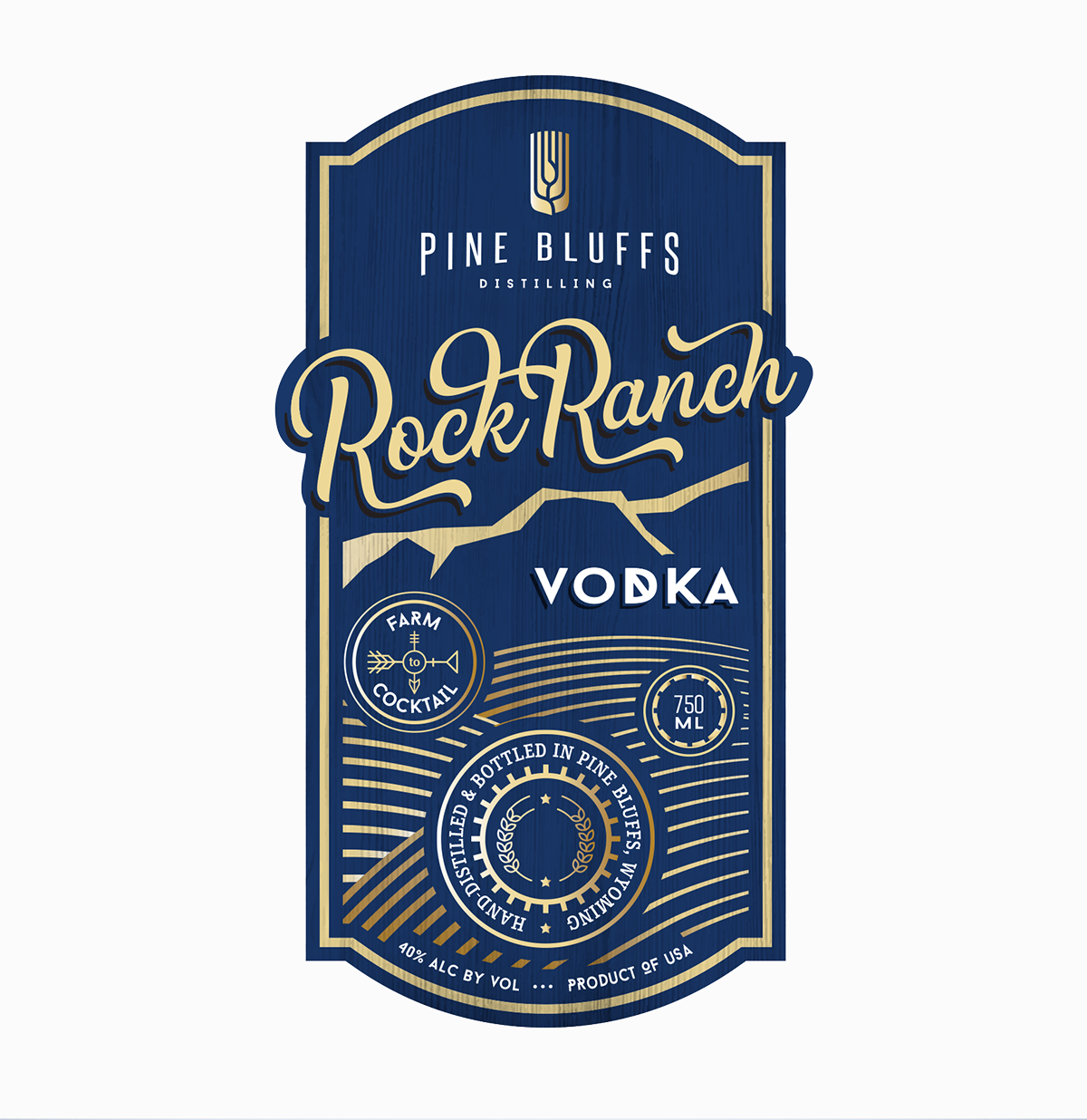
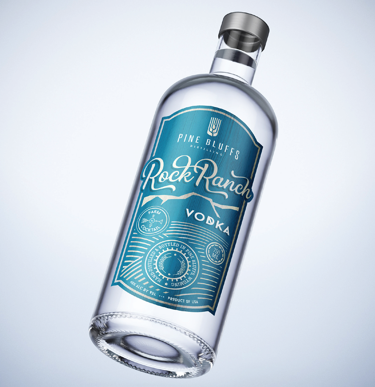
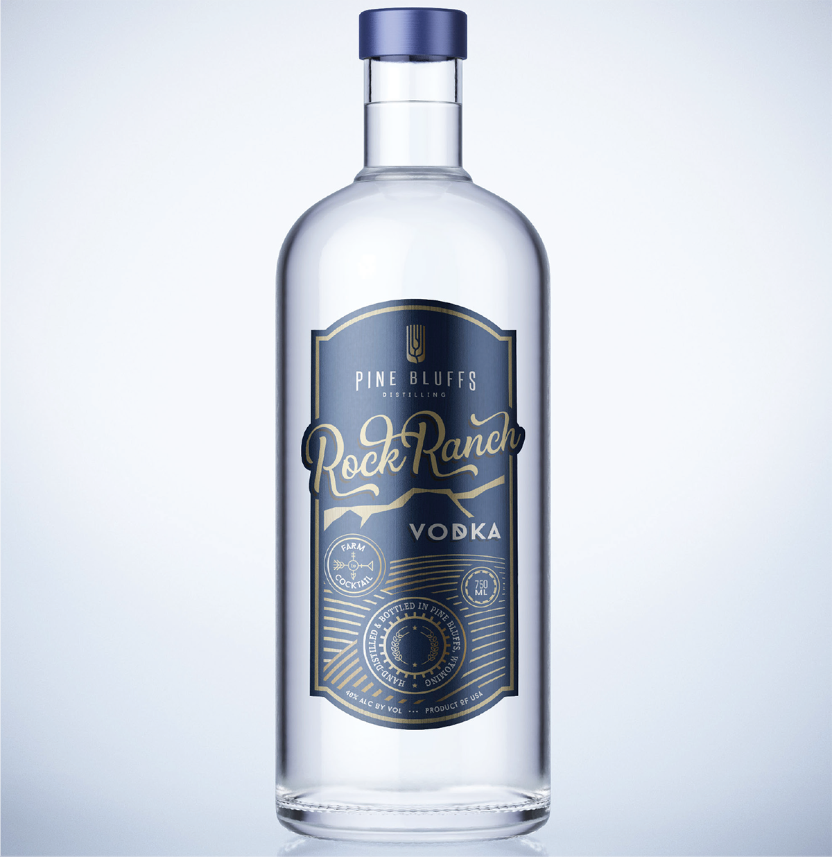
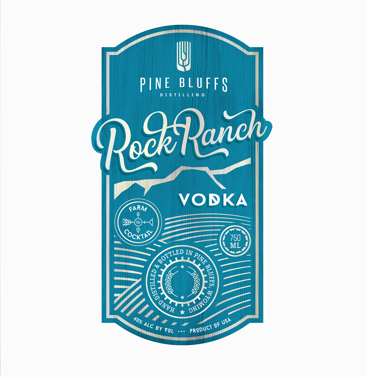
When they were ready to bottle their first product, we put together two very distinctive creative pieces for Pine Bluffs Distilling’s vodka bottle labels. Varied illustrative styles, label shapes, font treatments and color palettes (all within their newly developed brand standards) were presented to the Pine Bluffs Distilling team; they were able to select which design looked and felt like it paid tribute to their farm-to-distillery process and uniquely small-town Wyoming spirits, and would carry their brand through to future products.
Strategic Options Narrow the Focus
We started with the logo, first presenting several ideas in black and white only. This allowed the Pine Bluffs Distilling team to narrow their focus to just the artwork and typography, without getting hung up on color preferences. When we provided color options and brand marks for their favorites, the logo that would come to represent Pine Bluffs Distilling was made clear.
From here, we developed a set of brand standards and began to bring the brand to life, designing and developing their website and creating collateral print materials.
When they were ready to bottle their first product, we put together two very distinctive creative pieces for Pine Bluffs Distilling’s vodka bottle labels. Varied illustrative styles, label shapes, font treatments and color palettes (all within their newly developed brand standards) were presented to the Pine Bluffs Distilling team; they were able to select which design looked and felt like it paid tribute to their farm-to-distillery process and uniquely small-town Wyoming spirits, and would carry their brand through to future products.