
Your Instagram photo grid is more than just a collection of images – it’s your chance to make a solid first impression and showcase your personal or professional brand.
Whether you’re an individual user, a brand, a creative or an influencer, the consistency and style of your grid are crucial, especially if your account is focused on aesthetics or lifestyle. With the potential to capture someone’s attention within seconds, your grid has the power to leave a lasting impression and draw in a loyal audience.
Here are some steps to make your Instagram feed visually pleasing and cohesive so you can effectively engage your audience and leave a lasting impression.
Define Your Aesthetic
When it comes to defining your aesthetic on Instagram, it’s necessary to focus on creating a cohesive and visually appealing feed that reflects your personal brand or content niche.
Establishing a consistent theme, color palette or mood will convey your style and resonate with your audience. One useful approach is to choose a specific color combination or palette that compliments your content, whether it revolves around travel, lifestyle, fashion or any other niche. Incorporating a consistent font style for text-based posts and maintaining a balance between different visual elements can further enhance the overall aesthetic of your Instagram feed. Ultimately, your grid should represent the essence of your brand and create a unified look that distinguishes you from others. Consider describing your ideal feed with a few words to help maintain a consistent and visually appealing aesthetic.
Create High-Quality Content
Creating high-quality content for your Instagram can be the deal breaker for building a solid and engaging presence on the platform.
High-quality photos and videos capture the audience’s attention and reflect the account owner’s professionalism and dedication, making it even more important to use the best images and videos available while also being selective and strategic in their presentation. Utilizing smartphone apps or photography tools can significantly enhance the visual appeal of your content.
Utilizing popular image editing tools like Adobe Lightroom, VSCO or Snapseed can elevate the quality of your photos by adjusting lighting, colors and overall composition.
These tools offer a range of filters, presets and editing options that can help maintain a consistent and polished aesthetic across your Instagram feed. Additionally, attention to details such as composition, lighting and subject matter when capturing photos can be crucial in creating visually appealing content for your audience. Remember, high-quality content showcases your creativity and contributes to a positive and lasting impression on your audience.
Plan Your Grid Layout
Your Instagram’s layout is its foundation, which can collapse if not properly curated. Your grid layout is what visitors see first and influences their impression of your profile. By carefully arranging your posts, you can make a captivating feed that draws and keeps followers.
Tools like Hootsuite’s scheduling dashboard can help you plan and schedule posts in advance, guaranteeing your grid stays active with top-quality content. Reminder: Instagram Reels are part of your grid, so when you share a Reel, choose a cover photo that fits well with your overall grid aesthetic. This helps create a sense of consistency across your Instagram profile.
There are a few different Instagram layouts to choose from; here are a few.
1. The Traditional Grid
This grid style involves posting photos individually without a specific strategy. It’s simple and not too fancy; just make sure to mix things up a bit and avoid posting similar photos or quotes right on top of each other.
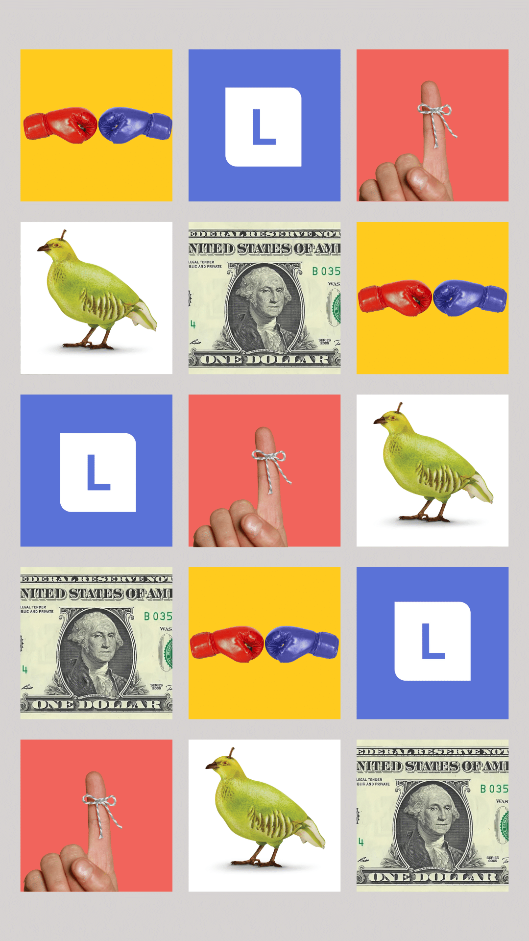

2. Diagonal
Keeping up a stunning Instagram diagonal grid layout means carefully curating your feed with eye-catching content. By strategically posting similar photos every fourth post, like inspiring quotes, you’ll achieve a cohesive and visually striking profile. While it contributes to an organized aesthetic, it can pose challenges in consistently finding and creating content to align with specific themes.
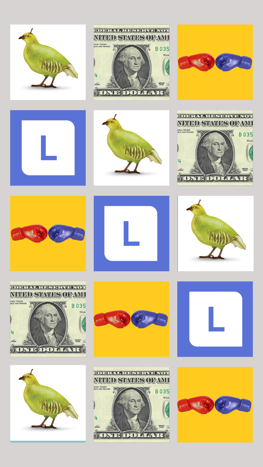

3. The Rows
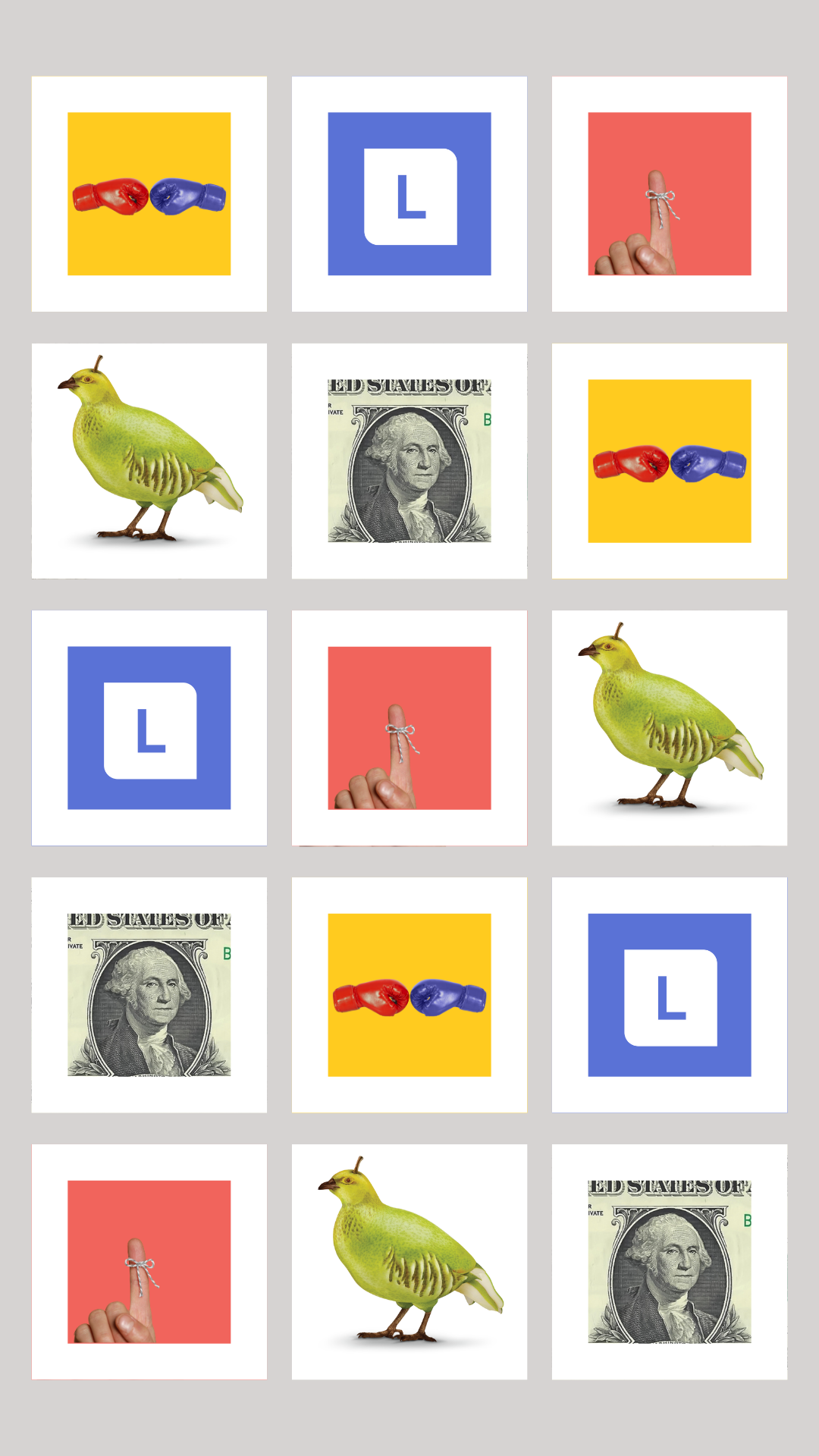
The row-by-row Instagram grid layout is a creative way to curate your Instagram feed. By posting three similar photos sequentially, you can tell a story or share information about your products or services. This layout is perfect for wellness professionals looking to highlight products, foods or ingredients while sharing benefits and tips for using them. The key to making this grid layout work is to ensure that the photos in each row have some relevance to each other, maintaining consistency with aesthetics and the story being told. With a keen eye for creativity and balancing, you can effectively implement this Instagram grid layout to create a visually appealing and high-impact feed.
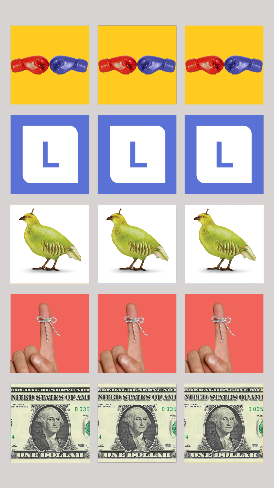
4. The Vertical Line
To create an Instagram vertical line layout, the key is to post similar images, such as quotes, text-based content or photos that fit the same color scheme, maintaining a consistent background in the middle of your feed to create the appearance of a vertical line, enticing the viewers to keep scrolling down your feed, as their eyes are naturally drawn to the middle column.


5. Borders
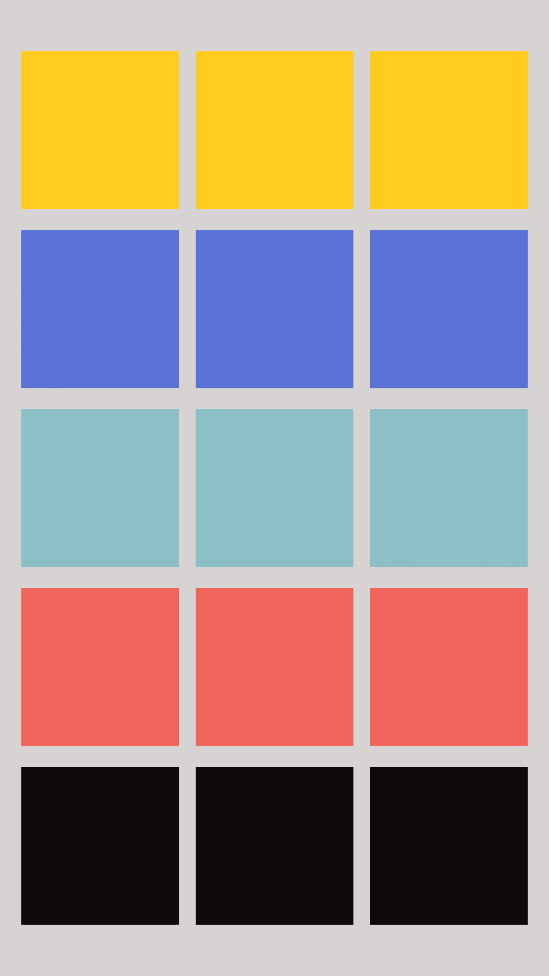
Consider adopting a border layout for a consistent and calming aesthetic when planning your Instagram feed. Adding white borders to your photos creates a sense of uniformity while allowing for creativity. Minimalist brands and influencers particularly favor this layout. Using apps like Canva or Instasize can help ensure that your borders are consistently sized. Mixing up grid layouts within your feed can add interest while maintaining a cohesive look. So, whether you’re a brand, photographer or influencer, the border layout is a versatile option to maintain a consistent and visually appealing Instagram feed.
Engage with Your Audience
When building your Instagram feed, it’s not just about what it looks like. Engaging with your followers through comments, likes and direct messages is key for building a sense of community and nurturing relationships.
Taking the time to respond to comments on your posts shows that you appreciate your followers’ engagement and encourage more interaction. Liking and commenting on your followers’ posts can significantly strengthen connections and show genuine interest in their content. And don’t forget to reach out through direct messages to express gratitude or have meaningful conversations – it can make your followers feel valued and part of a tight-knit community. Remember to be authentic and show genuine interest in your followers’ lives and interests. This approach will help create a supportive and interactive environment, making your Instagram channel a place where people feel heard and appreciated.
Crafting an eye-catching Instagram feed is all about strategic grid layout planning and actively captivating your audience. By following these essential steps, you can create a feed that not only looks visually stunning but also forges strong connections with your followers. An attention-grabbing feed encourages interaction and fosters meaningful relationships with your audience.
Ultimately, pouring time and effort into curating an engaging Instagram grid can elevate your visibility, cultivate a loyal audience and establish a robust personal or professional brand presence on the platform.

Danni Honeyman
Danni Honeyman holds the title of being the first intern at Linden. She is currently pursuing a degree in psychology with a minor in media studies, driven by her interest in comprehending the intricacies of the world and how it intersects with the media we consume.
