BRANDING
Pacific Soda
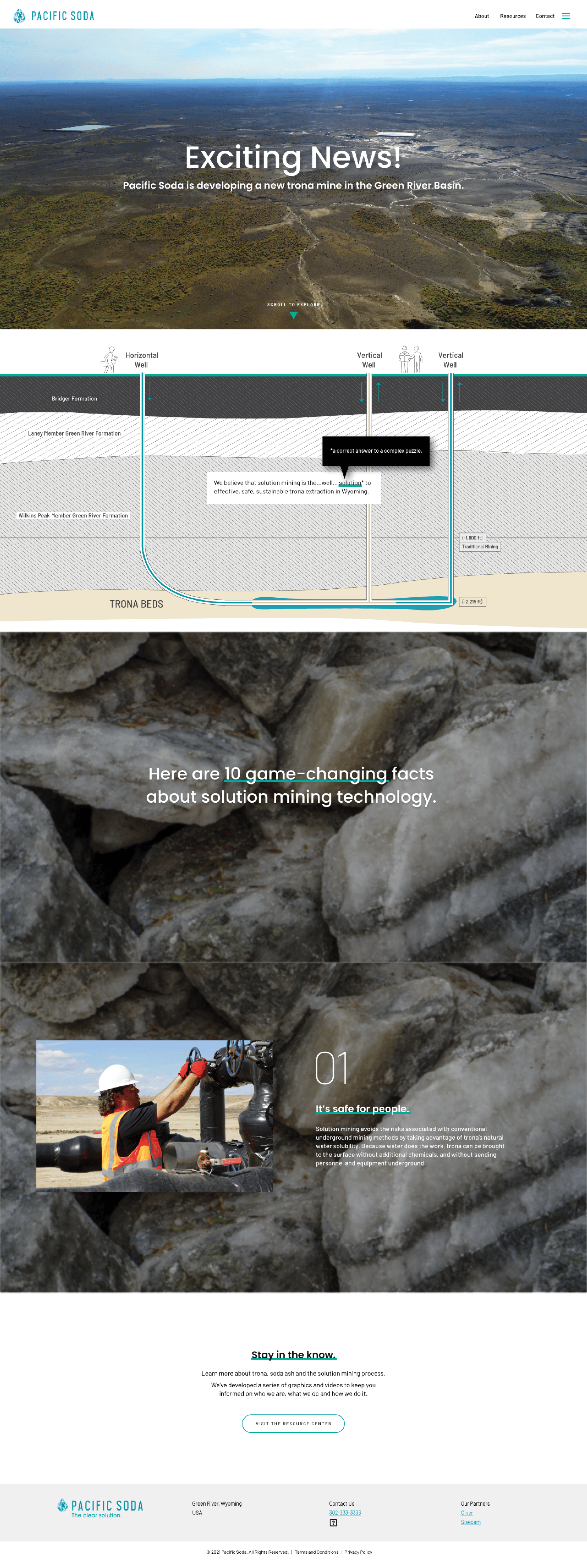
Linden first engaged with Pacific Soda to create a brand identity that would help communicate the project’s what and why and how to a variety of audiences.
Key Attributes
The key attributes the Pacific Soda brand needed to portray were clarity, approachability, innovation and professionalism. It would also be neat and intentional, with details about safety, the environment and solution mining itself found in accompanying icons and illustrations.
clarity – approachability – innovative – professional – neat – safe – intentional
The clear solution.
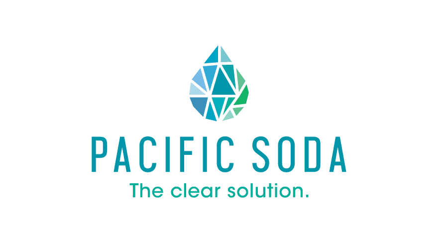
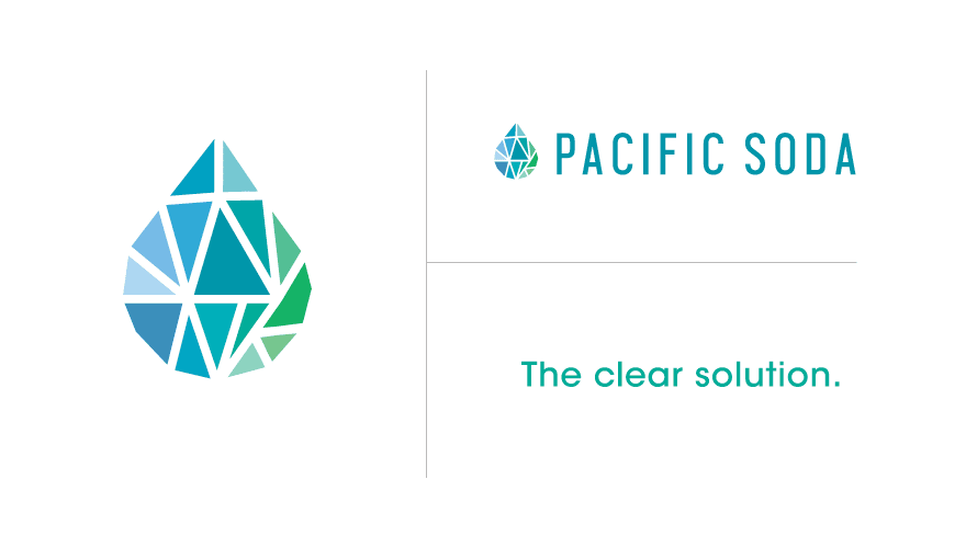
We developed a series of logos for Pacific Soda in black and white first, narrowing these down through surveys and discussions before adding color. The brand that became Pacific Soda was selected for its homage to water (and thereby solution mining), the way it looks clear and simple yet still unique, and how it feels inviting and positive through the brand mark, fonts and color palette.
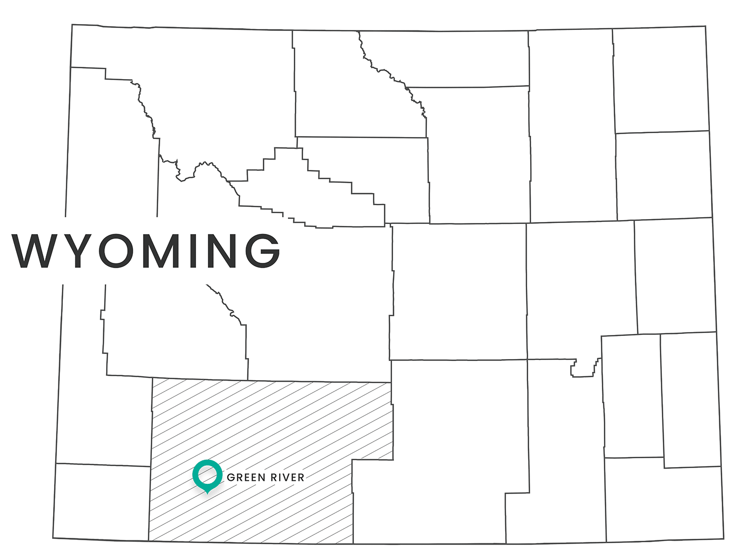
An accompanying tagline, “The clear solution.” was created to align the brand with Pacific Soda’s main messaging points for their array of audiences: The clear solution for people. The clear solution for the planet. The clear solution for progress. The clear solution for Wyoming.

Flow – Like Water
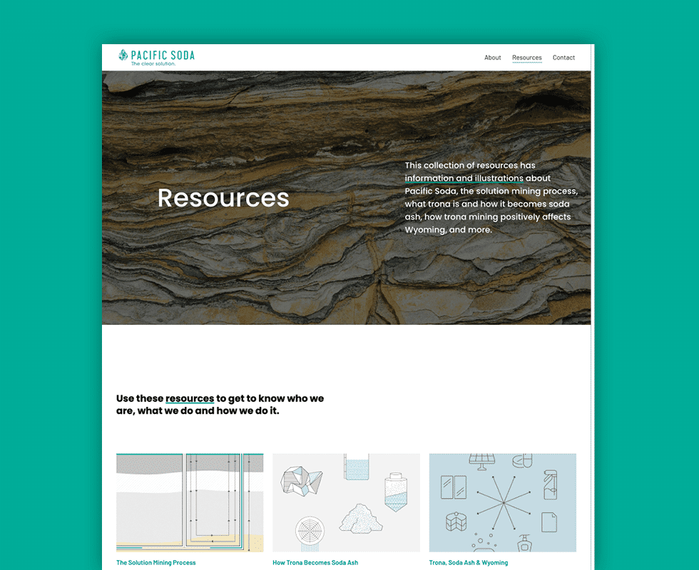
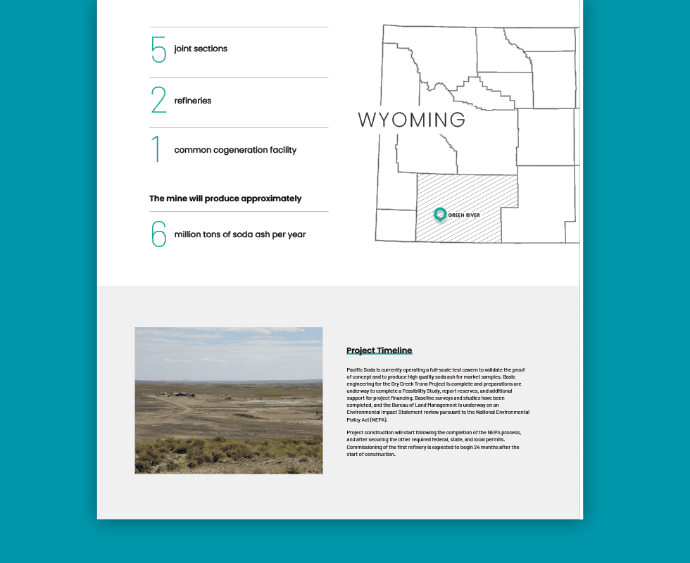
To further communicate the Dry Creek Trona Project’s value to Wyoming and to the nation, we developed a brochure for the Pacific Soda team to distribute and use to educate their audiences, outlining their key objectives and how solution mining in the area will achieve them.

