Fonts have always played an important role in communication, from signaling to certain audiences that you identify with them to helping with things like reading comprehension. Fonts can build your audience; they help pull people in. We could get into all the research and psychology of fonts, but we would much rather get straight to the point: how do you pair fonts? While most of the process of choosing fonts is up to interpretation and maybe even a little intuition, there are some tricks to the process. So let us help you with the logistics.
Types of Fonts
The first important step is understanding the different types of fonts, as this is the base knowledge for pairing.
1. Serif Fonts
The defining factor of this font is the dash or line at the end of the letters.
Serif fonts are known for their timeless elegance, making them the first choice for companies seeking a classic, more sophisticated look. Serif fonts are practical as they are easier to read, making them great for body text or areas where legibility is important.
Brands that use serif fonts include Rolex, Tiffany & Co., Mercedes-Benz.

- Old-Style/Humanist Serif Fonts: Old Style fonts have low contrast, wedge-shaped serifs, and a slightly left-leaning angle. They’re ideal for traditional branding like law firms.
- Modern Serif Font: Neoclassical or modern serif fonts are a typeface design that emerged in the late 18th century. They have highly structured letterforms, pronounced contrast between thin and thick strokes, a vertical axis of curved strokes, and frequently use ball-shaped terminals.
- Transitional Serif Font: Transitional typefaces combine old-style serifs with modern ones. Transitional serif fonts have sharper serifs than humanist fonts, and the letters have more contrast between the thick and thin strokes.
- Slab Serif Font: Slab serifs were popular for advertising in the 19th and 20th centuries thanks to their heavy serifs, consistent stroke weights and legibility. They look like sans serifs with added serifs, making them sturdy and utilitarian.
2. Sans Serif Fonts
These have letters without a dash or line at the end of the letter.
Sans serif fonts are frequently used in branding due to their legibility and versatility. They can serve as both headlines and body text and are often used for text logos. Just like serif fonts, sans serif fonts are incredibly versatile. Depending on their weight, they can portray different messages. Use a bold and heavy sans serif to grab attention to a headline or announcement. Or use a lighter weight san serif for a nice minimal accent. You can find sans-serif fonts in tech, fashion, banking, retail and more industries.
Brands that use sans serif fonts include tech companies such as Google and Netflix.

As some fashion houses update their brand towards a more modern aesthetic, many have begun to switch their logos to sans serif fonts, take Burberry and Yves Saint Laurent for example.


- Grotesque Sans Serif Fonts: Grotesque sans serifs were some of the first sans serif fonts with a geometric design and even stroke weights. They are great for making bold display fonts that need character and work well in editorial design or ad headlines.
- Geometric Sans Serif Font: The most popular out of the sans serifs font subcategories, Geometric are structured, geometric (as stated in the name) looking fonts. The stroke weight is consistent for the most part, making them great fonts for logos and headlines but not so great for longer text, as they are not as readable.
- Humanist Sans Serif Font: Humanists, or humanistic sans serifs, are defined by their organic feel and relationship to Roman inscription lettering. They are highly similar to serif-type fonts in both look and proportions, making them the most readable sans serif fonts and best used for long text.
3. Script Fonts
Script typefaces are based on handwriting strokes and are typically used for display printing, not extended body text. Great to use for a brand that is trying to appeal to the personal.
Script fonts are best used in larger spaces with room to shine, as scaling them down can affect their legibility. They look great in wordmark logos, stickers, labels and invitations.
Brands that use script fonts include Cadillac and Coca-Cola, which use formal script fonts, while Barbie and Ray-Ban use informal fonts.


- Formal Script Font: Formal script fonts are characterized by their elaborate design that features big, swirly bits. They lend an air of distinction and formality to any document. These fonts are best suited for formal events like weddings and business materials promoting luxury items such as handcrafted items or jewelry. Great for stationery items, too.
- Informal or Casual Script Font: Informal script typefaces mimic casual hand styles with a brush-script feel. They work well for clothing brands, hospitality, music festivals and creative industries.
4. Display Fonts
Display fonts, also known as screen fonts, are designed to draw attention and create a standout design.
Display fonts are rarely used for long bodies of text as they are harder to read when scaled down. Their main purpose is to catch attention, making them ideal for ads, billboards, business cards, etc. Most recommend not pairing display fonts with others unless paired with one minimal font.
Brands that use display fonts can be found in most vintage ads for brands in the 70s. Companies like Fanta, Lego and Disney use a display font as their logo.
5. Handwritten Fonts
Handwritten fonts imitate handwriting for an organic and personalized feel.
Handwritten fonts inspire creativity and informality, making them perfect for conveying emotions and establishing personal connections in digital designs. If a business is all for a friendly and relatable image, this is the best font. They work best on invitations, greeting cards, personal branding and social media graphics.
Brands that use handwritten fonts include Kellogg’s and Sharpie.
6. Monospaced Fonts
Monospaced fonts have equal-width letters and characters, unlike variable-width fonts. They are also called fixed-pitch or non-proportional fonts.
Monospaced fonts are ideal for brands prioritizing clarity and uniformity in their design. These fonts are perfect for achieving a retro, minimalistic, or even industrial look. They are commonly used in logos, headlines, posters and specific editorial layouts.
Brands that use monospaced fonts include IBM and Microsoft (as an homage to the monospaced font being the font of code). The X-Files is a good example of a monospaced font in logotype.

Factors to Consider When Pairing Fonts
(A cheat code for pairing fonts is using San Serif for heading types and Serif for body types. Sans serif fonts are perfect for headings as they have a straightforward quality, while serif fonts are easier to read, making them ideal for body copy.)
1. Contrast
The most important thing when pairing fonts is contrast, as it creates the hierarchy of importance within the text and helps distinguish between the different parts of the text (title, headline, body). Contrast also keeps things interesting, grabbing the viewers’ attention and holding it. To create contrast, there are a few factors to consider.
Weight: How bold or thin a text is.
Different fonts come with different weights. Lato has five weights, while Ariel only has two. The more variety of weight there is to a font, the more options there are when pairing fonts. Sometimes, switching up the weight is enough of a drastic change that the need for another font isn’t necessary.
Point Size: The size of the text.
Playing with size is not only a great way to create hierarchy within the text but also creates a separation between the information provided. Messing with the size of fonts is also a great way to figure out which font is best for which section of the text (title, heading, body), as some fonts call more attention when bigger, and others become harder to read when smaller.
Color: Typographic color is the darkness or lightness of a text block.
It’s emphasized when you squint at the text. Factors like leading, kerning and font size affect typographic color, so it’s essential to ensure that your chosen fonts contrast enough in this area.
Font Variations: Different font appearances, such as bold, italicized and letter spacing.
It’s a great idea to use different font styles to distinguish text. However, testing these font styles is equally important before selecting a font pair. You should ensure that your font pairing looks good in its default form as well as in bold, italic, and bold italic text. If you fail to test your font pairing with these variations, you may end up with unattractive font clashes that won’t be immediately noticeable.
2. Similarity
Keep key characteristics similar between fonts! Good font pairing requires contrast, but too much can be distracting and uncomfortable for readers. Keep similar font characteristics to avoid strong contrast. Here are some factors to consider.
X-Height: The height of the letter “x” in a font.
Fonts with similar x-heights usually pair well. Montserrat and Cardo are similar in x-height, making them a successful pair.
Font Families: Groups of related fonts that share similar characteristics.
These are variations of a central typographic theme and complement each other perfectly when used together. For example, PT Sans Bold and PT Serif are visually pleasing as they share a similar structure but still have enough contrast to make them interesting.
Mood: Font mood refers to the emotional qualities of a font, such as playful, mysterious, serious or sad.
The mood is subjective but important in font pairing. Incompatible moods can disrupt the design. For example, Modak and Indie Flower have mismatched moods.
3. Personality
When we say personality, we mean what you are trying to portray through your choice of fonts. What is your brand all about? What are you selling? Who is your clientele? What industry do you work in? These factors go into not only what fonts you might want to choose but also how you might like them laid out.
Examples of Font Pairing
1. Popular font pairings
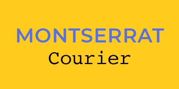
Montserrat + Courier New
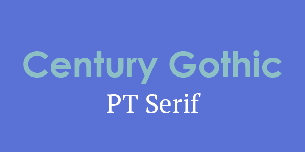
Century Gothic + PT Serif
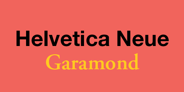
Helvetica Neue + Garamond
2. Creative font pairings
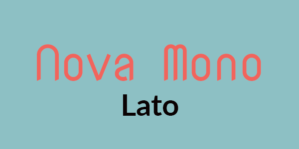
Nova Mono + Lato
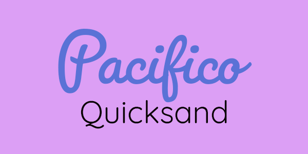
Pacifico + Quicksand

Bebas Neue + Montserrat Light
Fonts are often the first thing that people notice when they see a document, logo or website. Choosing the right fonts is critical, but it can also be a daunting task. While the process of choosing fonts is largely subjective, there are some tricks to the process that can help you pair fonts effectively. Understanding the different types of fonts, such as serif, sans-serif, script and display fonts, is the first step. Each font type has its own unique characteristics that can influence the tone, style and readability of your text. So whether you’re creating a logo, designing a website or writing a report, choosing the right fonts can make all the difference in how your message is perceived.

Danni Honeyman
Danni Honeyman holds the title of being the first intern at Linden. She is currently pursuing a degree in psychology with a minor in media studies, driven by her interest in comprehending the intricacies of the world and how it intersects with the media we consume.
